Redesigning Virgin’s Home Page
For one of my first UX student projects, I wanted to do a design study/redesign on a major corporation’s website, a brand that anyone would recognize. In the wee morning hours of my hunt, I stumbled across a Hubspot blog article listing the UX Awards 2014 Grand Prize winner… Virgin America’s responsive redesign by Work & Co. Excited to explore the design further, I clicked on the link only to find…

I don’t think the word “disappointment” quite covers this.
Turns out when Virgin America was sold to Alaska Air in 2016, the brand was altogether erased during last year’s merger. Anyone looking for Virgin America (who has obviously been under a rock like myself) is directed to Virgin’s main website… this monstrosity.
For a multi-billion dollar company’s main website, I expected something more sleek and pleasant to the eyes. The navigation was also confusing and what I would describe as “all over the place.” I realize that Virgin has a LOT of enterprises (who knew they made wine?), but surely there might be a different way to consolidate the home page. Something less busy and more streamlined to draw the user in to explore all that Virgin has to offer.
I love what Virgin has to offer philanthropically. Even with all of the different “branches” to this company you can see that the owner, Richard Branson, is deeply invested in people. I feel like the current design draws attention away from that. More focus should be put into drawing the user’s attention to featured stories about the things Virgin is doing for people.
For instance, the Virgin Sport ASICS London 10K, which partners with Run for Charity. Participants raise on average £324 for their charity of choice. As the featured story for the day that I visited, I wanted to focus more on this as the centerpiece for my redesign.

Two things I wanted to ensure is that (1) the user knows without a doubt that this is Virgin’s website and (2) the user immediately gets a view of human stories. Large brands can often get lost behind their logo, but today’s informed user wants to know about a company’s overall contribution to the world. Are people the highest priority? What steps are they taking to be more sustainable? What does this company have to offer to their community and the rest of the world? A large, loud splash of Virgin red doesn’t tell that story. In order to get a comprehensive view of a company, users need to see something simple and focused to ease them into the corporate giant that is Virgin.
Oh, look at the work they’re doing. Great! I want to click on “Discover Virgin” to learn more about the company and what it has to offer. Wine? Planes? Racing? Mobile phones? Humanitarian projects? Environmental contributions? Imparted wisdom from the owner in his own personal blog? Wow!
Should users be bombarded with all of this straight away or should Virgin aspire to genuinely draw them in?
Users tend to spend more time on the website if they see something that strikes their interest, even if it’s something as simple as a beautiful photograph. If the user feels overwhelmed at the onset, they will invest less time in the online experience.
In today’s digital age, a company’s website is its first ambassador. That carries a heavy weight. You have one chance to grab a person’s attention; one chance to tell a story. What kind of story do you want to tell? Do you want to just “dazzle” or do you want to engage the user on an emotional level?
As user experience professionals, our goal isn’t simply to dazzle… it’s to tell a story. Draw a person in and invite them to “stay.” Stunning photography and graphics will only get you so far, but the marriage of the visual and the emotional is what truly grips your attention.
I wanted to create a working prototype, incorporating menus to demonstrate how the user would interact with the homepage. A human-centric company should have a dynamic website focusing on the people who make Virgin what it is today.
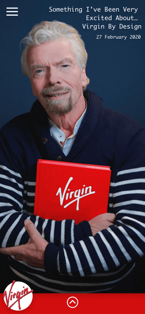
A particular article caught my eye as I revisited their current website: “Virgin By Design.” As I read through the article, I felt compelled to take notes. This gave way to an unintended mood board as I began to doodle around the key phrases and words that stood out to me. I started to get a better idea of where I wanted to take this redesign.

How does one design for an established company of fifty years that still has a modern, youthful edge? How do you take fonts, colors, and layouts to communicate things like “creating feel-good experiences” and “taking bold risks?” I went back to my original design and looked over Virgin’s current website to create a more structured mood board with colors, fonts, buttons, and different logo designs.

I took another look at the user’s journey as well. What did it look like with the current website? How did I want to simplify it with my redesign to make certain tasks for the user more clear and easy to accomplish? Since Virgin’s website is so expansive, I decided to focus on one task, mobile payments, and narrow down the focus even more to the mobile site. With our increasingly mobile digital culture, bill pay through mobile devices is an increasingly likely scenario. How would that look for someone wanting to pay their Virgin Mobile bill?
Currently, the user’s journey just to find the log in screen is quite arduous. I used Balsamiq to create a new user journey and then wireframes with a more streamlined approach.


A more finished example of the mobile site was created in Adobe XD…


… and then in Adobe Photoshop.


